Contents
Colour mixing

This overview of colour mixing using the Artist's Helper skips over many technicalities and caveats but it will be followed by further examples in more detail.
First we identify the colour we want to mix and create a palette entry for it.
 These are samples from a Starter Set of 5 Royal Talens Cobra water mixable oils on a pad of palette
paper.
These are samples from a Starter Set of 5 Royal Talens Cobra water mixable oils on a pad of palette
paper.
Next we arrange samples of our ingredient paints on our palette or on a card and load a photo of them into the Palette 2 tool tab.
or drag and drop an image onto the Palette 2 tool tab.
For each paint select a sample from the photo to create a palette entry marked as an "available" colour.

View the palette entries in the colour space widget. Use drag to spin and tilt the display to get a feel for the entries' positions in the colour space
Before we go to the Mixing 6 tool tab we should make a couple of notes about colour spaces and the dimensions of colour…
Three dimensional chess
Colour spaces


Just pick one and stick with it.
I always use CIE L*C*h°(ab).
From here on I'm assuming you are using it too.
Why CIE space name abbreviations are so confusing
Every article I've read has used slightly different abbreviations for the colour spaces.
Asterisks are sometimes added after the dimension initials as in
CIE L*a*b*.
Wikipedia says
: The asterisk (*) after L, a and b are pronounced star and are part of the full name, since they
represent L*, a* and b*, to distinguish them from Hunter's L, a, and b, …
LCh inserted in any name denotes that polar coordinates are being used (chroma and hue) rather than cartesian coordinates. That doesn't change the space itself only its addressing.
If the dimension initials in brackets are missing they almost always mean
ab
.
The
L
dimension initial is (almost) always in uppercase but the
av
or
uv
are usually lowercase. The publication year can be appended, sometimes.
So
CIELAB
≈
CIELab
≈
CIELab76
≈
CIE L*a*b*
≈
CIE L*C*h°(ab) 1976
≈
CIELCH
≈
HLC.
The dimensions
There are many ways to quantify colours. Some, such as the RGB and CMYK models, introduce dimensions based on how the colours are created with lights or pigments. Others, including HSL or The Munsell system, try to reflect how colours are perceived (with varying degrees of success).
The the latter group often include three dimensions to quantify:
Hue the angle around the central value axis.
The closest colour on the colour-wheel.
Value, brightness, lightness or tone distance vertically parallel to the central axis.
A ranking of the amount of light present. Either as an absolute measure or in comparison to a similarly illuminated white.
Saturation, chroma, intensity or colourfulness distance radially from the central axis.
The perceived amount of difference from a grey of the same lightness. Refers to the purity of the colour. Colours produced by a single wavelength of light are considered more saturated than those produced by a mixture. With allowances for extra spectral colours which can't be produced by a single wavelength.
Four-part harmony
No matter how many paints we have available, any colour that can be mixed from all them can be mixed from a selection of just four of them.
Great, which four? Choose a pair of saturated colours whose hues are either side of our target's hue, plus black and white.
The Zorn palette is a great example what can be done with this sort of four part mixing. He favoured yellow ochre, vermilion, lead white and ivory black.
The basic flow
Perform all the following steps virtually in the application in order to develop a plan. Then perform them again for real when actually mixing the paints.
One thing at a time
When mixing paints we can greatly simplify things by focusing on one of dimension at a time.
Hue
We start by choosing a pair of ingredient paints which have hues either side of the target's hue and create a mixing line from them.
Select the two ingredients and press M to create a mixing line in the Mixing 6 tool tab.

You can see the
mix 1
icon is at the same hue angle as the target colour (51°, albeit darker and more saturated).

Adjust the ratio of the ingredients until the mix has the same hue as the target.
Repeating this step with real paints will be easy as it is simply adjusting the relative proportions of two paints.
Value
Next we can select a lighter or a darker ingredient to adjust the value.


Adjust the ratio of the ingredients until the mix has the same value as the target.
Again, when we repeat this step with real paints we are just doing a one dimensional proportional mix. As long as the value of the target is somewhere between those of the end points we are definitely going to go past it at some point.
Saturation
Next we would normally adjust the saturation. This is almost always a case of reducing it by adding a little grey of the same value. This is because the our ingredients for the hue were saturated paints straight out of the tube.
When we are reducing the saturation by adding a grey we should put a little of the mixture aside so that if we go too far we can use it to increase the saturation again.
Finally I added a tiny bit more red to bring the hue back.

Studio set up
During a project we may take dozens of photos of our paints and of our canvas and load them into the application. If we can set up our environment to do this slickly it will save us effort in the long run.
In order to get consistent, accurate colours in our photos we can either:
- shoot in a consistently lit environment using consistent manual camera settings
- or include known reference colours in our images and colour correct the images in the application.
Lights, camera, action
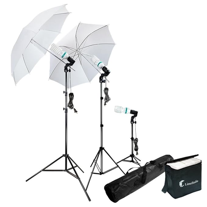
I like to paint with my canvas vertical on an easel. I've set my camera up on a tripod behind me and a lamp at 45° to the canvas either side. I mix my paints on a glass palette on a desk to one side then put samples on a card on the easel to take photographs.
If you like to paint horizontally on a desk the whole setup might be easier if you can get the camera high enough.
My study has shutters to keep the variable daylight out and a couple of cheap 5500k, high CRI lamps to ensure consistent lighting. I use a camera with manual settings which I set once and then use for every shot.
This setup will give us consistent colours rather than accurate colours. If the lighting was from incandescent light bulbs then that would give a warm light which would lead you to mix cooler colours and the painting may end up with a cooler colour bias. This isn't as much of a problem as you might think but it's usually easy to obviate anyway. Use daylight rated bulbs or LEDs with a colour temperature of around 5500k and you should be ok. Or, if you already know where the painting is going to be displayed you could try to repeat the same lighting.
Communications
It is good if we can get our photographs to our computer quickly and simply.
My camera has WIFI and can talk directly to my laptop. Setting it up is a bit of a pain though and using it prevents me streaming music at the same time so I prefer to use a USB cable between the two. The software that came with the camera ( Imaging Edge Remote ) allows me to control it and take photos from the laptop and have the image file automatically transfered.
The Artist's Helper can monitor a directory and can automatically load the photo as a canvas or palette image as soon as it appears so you don't have to do it manually.
              Miscellaneous
              Monitor image directory
              Miscellaneous
              Monitor destination palette
                ⌥⌘P
or
              Miscellaneous
              Monitor destination canvas
                ⌥⌘C
I have my laptop on a table beside the easel. I can take a shot without going back round to the camera and have it appear in the application straight away.
Colour correction
If we cannot get good, consistent, white lighting, then we should perform colour correction on the photos of our palettes and canvases. We need to include something of known colours in the photos and then process the images to make the colours of those items correct.
Level 1
At the simplest level we can place a single neutral coloured item, such as a sheet of white paper or a photographers grey card, next to the palette or canvas before we shoot. This should tell us the colour bias. Load the photo into the app and create a temporary palette entry from the object. With this entry selected we can run the colour correction filter for the whole image to make this area a true neutral.
The temporary palette entry can be deleted afterwards.
Level 2
To get a little more accuracy we could place black and white reference objects in the scene and create two temporary palette entries from them. This will allow the processor to scale the channels until the selected entries have become true black or white. This type filter will be done if you run the colour correction with two palette entry selected.
Level 3
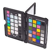
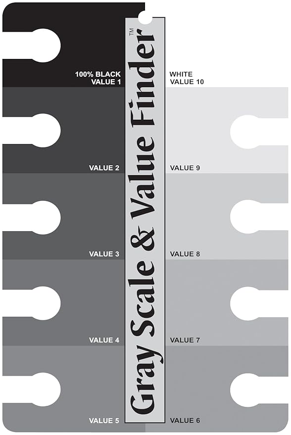
Finally we could place references of known colours into the scene such as the colour checker cards below. We can configure the application with these colours and process the image until those areas match the configuration.
The colours to be used need to be configured in the preferences.
If you have the X-Rite ColorChecker Passport or the Gray Scale & Value Finder then life is easy as I've added menu items to configure the colours I read from my cards with a Colourpin scanner.
          Miscellaneous
          Set reference colours
          XRite Passport
            references
          Miscellaneous
          Set reference colours
          Gray
            Scale & Value Finder References x 4
          Miscellaneous
          Set reference colours
          Gray
            Scale & Value Finder References x 6

When we import a photo of a palette or canvas that includes a colour reference card we click on the known colours to create palette entries. These entries need to be selected when we run the colour correction filter.
XRite Passport
The only colours I use on the Passport is the row of six grey cells (the bottom row in the picture above ).
| #fefcf7 | #d4d7d6 | #acafaf | #818483 | #5d6262 | #3e4241 |
colour_correction_references_000 = 0x3e4241
colour_correction_references_001 = 0x5d6262
colour_correction_references_002 = 0x818483
colour_correction_references_003 = 0xacafaf
colour_correction_references_004 = 0xd4d7d6
colour_correction_references_005 = 0xfefcf7
Gray Scale & Value Finder
This reference card has ten entries which is overkill for our purposes. I like to use just the four corner values.
| VALUE 1 #494643 | VALUE 10 #eff0ec |
| VALUE 2 #615f5e | VALUE 9 #dddfdc |
| VALUE 3 #777776 | VALUE 8 #cfd1ce |
| VALUE 4 #8a8b89 | VALUE 7 #c0c1bf |
| VALUE 5 #9c9d9b | VALUE 6 #adaeac |
colour_correction_references_000 = 0x494643
colour_correction_references_001 = 0x9c9d9b
colour_correction_references_002 = 0xadaeac
colour_correction_references_003 = 0xeff0ec
If you feel short changed that the XRite folks have more data points then you could use the middle ones too:
| VALUE 1 #494643 | VALUE 10 #eff0ec |
| VALUE 2 #615f5e | VALUE 9 #dddfdc |
| VALUE 3 #777776 | VALUE 8 #cfd1ce |
| VALUE 4 #8a8b89 | VALUE 7 #c0c1bf |
| VALUE 5 #9c9d9b | VALUE 6 #adaeac |
colour_correction_references_000 = 0x494643
colour_correction_references_001 = 0x777776
colour_correction_references_002 = 0x9c9d9b
colour_correction_references_003 = 0xadaeac
colour_correction_references_004 = 0xcfd1ce
colour_correction_references_005 = 0xeff0ec
If you have any other colour reference cards you can configure them yourself via:
Uneven lighting correction
Avoid using this if you can. This is only needed if your canvas or palette is lit badly and is brighter one side than the other. It is much better to correct the lighting than use this filter but sometimes that is not possible. Details can be found here.
Again in a little more detail and with actual paint
It is a good idea to mix a few practice colours before mixing any colours required for the painting.
Whilst we are doing colour mixing it is more convenient to view the colour space widget in the left hand side of the screen instead of in the tool tabs on the right. This way we can see both the Colour space 2 and either the Palette 2 or CS options 5 or Mixing 6 tab at the same time. Do one of:
          View
          Left pane
          Colour space ⌃2
or
          View
          Left pane
          Show tabs ⌃T
and then choose the Colour space 2 tab.
Make sure the appropriate entries are being shown in the colour space widget. Select the checkboxes in the CS options 5 tab or check the menu items
          Colour space
          Show palette entry names
          Available
          Colour space
          Mixing entries
          Target
          Colour space
          Mixing entries
          Ingredients
          Colour space
          Mixing entries
          The mix point
Having chosen the colour we want to mix we can set it as the target colour. Select it in the table then:
We already created a set of palette entries from a photo of our paints laid out before. Save the palette entries for the current palette image so that they can be reloaded for use in other projects.

TODO show more colour mixing. Maybe a colour string too.
Save the project
We should note that this mixing method doesn't create a painting with the same colours as the reference subject image. What it does create is a painting that, when you take a photo of it, the photo has the same colours as the reference image. This difference is negligible. It can even be argued that it is a good thing as it is likely that more people will see photos of the painting than the painting itself.
At the end of every page save the project again.