Contents
Scaffolding
We need to get a sketch onto the canvas as the scaffolding from which we can hang our paint.
There are all sorts of ways to copy our reference onto our canvas.
We could draw a sketch freehand. Either full size the directly on the canvas or on paper and then transfer it by one of the methods used for transferring from printouts mentioned below.
We could use the grid method. We can show a grid over our virtual canvas, draw the same size grid on our real canvas then use the grid coordinates to create our sketch.
Or the messy grid method
.
You could use a projector or a camera lucida.
Or we could simply print out our reference, filtered and scaled to the size of the canvas, and then trace it.
All of these methods are easier to do if we first get our program to produce a simplified sketch that we can work from rather than the full reference image. So I've added a layer containing a machine generated sketch which we can use instead.
The sketch filter
This is technically a subject filter but the result is written to its own
sKetch layer
rather than the filtered Subject layer
so it is in the Other filters
sub-menu.
Selecting this item will cause the sketch configuration dialog to be displayed.
The contrast multiplier value controls how high contrast the sketch is,
that is the lighter values are pushed even lighter and the darker values darker.
The contrast centre value controls where the centre of this contrast push is.
The further a value is from the centre the more extreme the enhancement.
If the contrast centre is near the middle the the lightest and darkest values will be made extreme.
If the contrast centre is near the top the light values will remain largely unchanged but any darker values,
which will be most of them, will be made even darker.
We should probably aim for much less detail than we think we'll need. The sketch is only there to give us a broad placement map of the larger objects in the scene.
so the contrast centre makes no difference

multiplier 1 centre 2%
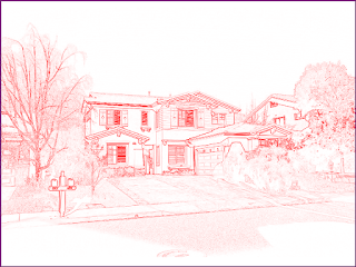
multiplier 1 centre 50%

multiplier 1 centre 98%
Enhance the sketch Rarely necessary
The sketch is probably all we will need, however, we could consider combining some other layers.
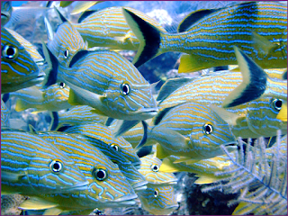
Sweetlips
Suppose an artist any wanted to paint this rather complex picture.
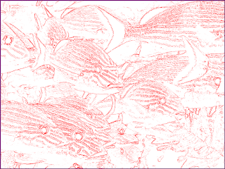
Contrast multiplier 6 centre 90.
After putting an oil filter (3, 5) on the reference to simplify it a little, a good sketch configuration might look something like this.
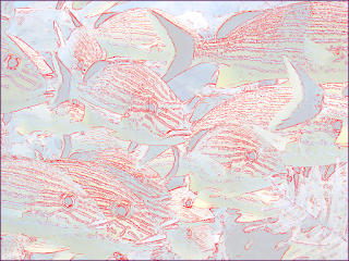
alphas: sketch 1.0, subject 0.2, others 0.
It is easier to see the individual objects by blending in the Subject layer.
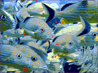
The Paints layer with 12 enabled palette entries.
After sampling a dozen colours for palette entries the Paints layer looks like this.
increasing comparison thresholdstrategy.
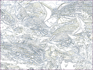
The Outlines layer
The outlines look complex, even with the oil filter, but though they aren't totally impossible they are still hard to make sense of. It would be easy to get confused while making a tracing from this.
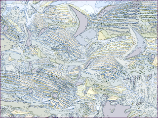
alphas: outlines 1.0, paints 0.2, others 0.
It is a little easier to follow with a little colour from the Paints layer blended in.
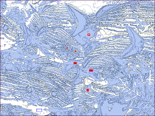
alphas: outlines 1.0, selections 0.3, others 0.
It might be even clearer if we blended in the seLections with half of the entries selected so some are highlighted and some are blank.
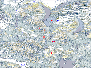
alphas: outlines 1.0, selections 0.3, others 0.
To differentiate the areas a little more the seLections can be made to show the palette entry colours instead of the selection highlight colour.
selected area bluethey are now various shades of
under-water blueand
submarine yellow.
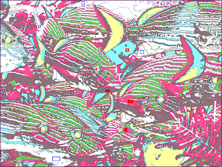
alphas: outlines 1.0, selections 0.7, others 0.
When the palette entry colours are too close (like they are here, even though her selection strategy was good) we can show replacement colours for each. With the entries selected:
effective colourmeans the replacement colour if there is one or the entry's colour if not.
It's not pretty but it is much easier to trace.
Outlines HQX
double outlines
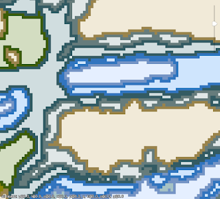
Whilst we are discussing outlines notice that every paint region is outlined. So each line is twice as thick as we might naively expect. If each region has a one pixel border then any two neighbouring regions will have a two pixel border between them.
The outline colour can be changed with:
- Black set with an alpha of 0, the default, means use the paint colour.
- Red set with an alpha of 0 means use the paint colour but make it a bit lighter.
- Blue set with an alpha of 0 means use the paint colour but make it a bit darker.
- Green set with an alpha of 0 means use the paint colour but light colours are darker and dark colours are lighter.
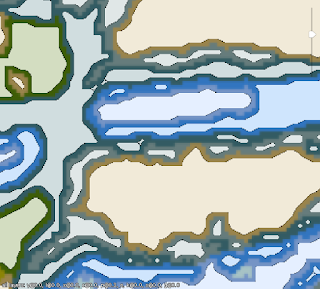
HQX 4
Zooming in so much we can see the individual pixels may make us wish we could smooth out the outlines a bit.
Check the subject composition
This is last chance to unlock the layout and finesse the subject position.
After we set the print page details and the image alignment markers
and then re-lock the layout
any further modifications would be ill advised.
Notes on composition.
Setting up the print pages
We only need to consider this section if we're going to transfer a sketch to the canvas via a printer. Skip it if you're going to transfer your sketch using a grid, messy grid, projector or other method.
If only I could print it out so that… Ah! I get it now!
We've already told the application how big our physical canvas is for this project. Later, when we request a print out, we want enough pages to be printed to cover the whole thing.
So we need to tell the program:
- how big the pages are ‡
- whether we want them portrait or landscape
- how much we'd like the pages to overlap to make it easy to line them up
- where to start if we don't need to go right to the edges
Some of this configuration can be edited via
US letterpages on an HP Envy printer (yuck). They seem to work fine for my newly acquired Brother laser printer (HL-L3290CDW). You may need to do some tweaking for your particular printer.
properinternational paper sizes rather than the odd 8.5x11" US letter stuff.
helplinked from within the dialog itself).
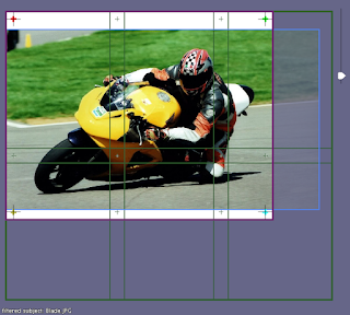
This 14x18" project would normally need six pages
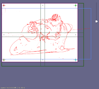
We could get it down to four with landscape orientation
page alignment markersin the overlaps of the pages (their visibility can be set from the Work area menu) as well as the coloured
image alignment markersnear the corners of the canvas.
There's often a lot of space at the edges that we don't really need to print and trace. In the example above most of the first page is black. We can move the point at which the printing starts.
The boundaries of the printed pages can be moved with respect to the canvas by holding down and dragging.
For canvas sizes requiring multiple pages moving the offset for where the printing starts might mean we can print fewer sheets without losing anything interesting.
Also consider moving the page boundaries to avoid any edges and overlaps crossing important places such as someone's eyes.
Set the image alignment markers
The are four coloured crosses initially placed near each corner of the canvas area. These are used when we align the photographs of our work-in-progress with the reference image in the work area.
They always show when the layout isn't locked. When it is locked they can be toggled with:
page alignment markerswhich are printed near the corners of each transfer page, though they are sometimes co-located.
The image alignment markers
need to be traced (or otherwise transfered) onto our physical canvas.
We can move the image alignment markers
by pressing and dragging them.
The image alignment markers
should be as far apart as possible.
If they are too close together any inaccuracies made lining them up will be greatly magnified.
| Top L red | Top R green |
| Btm L yellow | Btm R blue |
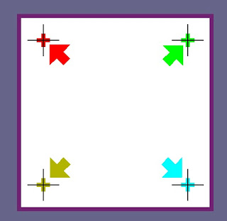
Try to keep them near their own corners. It'll be exceedingly confusing if we swap them round as later we'll have to match each of them up with their canvas counterparts when we overlay the photos of our work-in-progress.
image alignment markerswhich we transfer to the physical canvas. The arrows are the
image alignment pointers. When the canvas is photographed and loaded the pointers will be moved over the tracings of the markers so the photograph can be transformed to match up with the reference.
Spengler: Don't cross the streams.
Venkman: Why?
Spengler: It would be bad,
Venkman: I'm fuzzy on the whole good/bad thing. What do you mean,bad?
Spengler: Try to imagine all life as you know it stopping instantaneously and every molecule in your body exploding at the speed of light.
Stantz: Total protonic reversal!
Venkman: Right. That's bad. Okay. All right. Important safety tip. Thanks, Egon.

Who you gonna call? (Ghostbusters)
Badda baa-da baa-da baa-da.
Dubba dubba dubba baa-da dah.
Remember the image alignment markers
need to be inside the printed/transfered canvas area
but not necessary within the subject image.
I ain't 'fraid of no ghostI hate the phrase
Doom. Da doom doom doom.
earworm. Horrible.
Toggle the worst of this humour
with this button
Lock the layout
Once we are happy with the layout, we should lock it. Again. For good this time.

Axel-Fcan always oust any other earworm.
Doop.
Doop.
Do-ba do do doop.
Do do da pa-da pa-da doop da.
We can hide the page boundaries now as they are no longer needed.

The Final Countdown.
Badda ba - da.
Badda ba da da.
Badda ba - da da.
Badda ba da da da.
We can hide the page alignment markers
too. They never were needed on screen.

Eye Of The Tiger(last one, I promise).
Dom.
Dom-pa dom dom.
Dom-pa dom dom.
Dom-pa dom daahh.

Do do da pa-da pa-da doop da.(Same one as before, doesn't count).
Save the project
Now is a good time to save the project again.
Transferring the sketch
As previously mentioned we have several options for transferring the sketch. Now is the time to choose one and actually do it.
block-incolours, then transfer a more detailed sketch over the top. In this case we should transfer the page alignment markers to make it easier to line up the second sketch stage with the first.
- smooth, thin, fast drying acrylics: maybe
- thickly textured, slow drying oils: maybe not
Freehand sketch
If we think we are good enough we could just copy the reference freehand but we will subsequently lose some of the comparison functionality.
Print and trace
This is very straight forward for one sheet. Use masking tape only on one edge so that we can slide transfer paper under before we start, perhaps changing colour part way through and lift it repeatedly during tracing to check everything without moving the sheet.
Remember to trace the image alignment markers
.
Aligning multiple sheets
If we have 2 or 4 sheets (maybe 6 or 8 at a push)
the easiest way is to put pin holes through all the page alignment markers
,
pin them all together and then tape them before moving them to the canvas.
I lay them out on a board (or more usually the carpet), pin them all together, then tape them and remove the pins.
The whole lot can then be moved to the canvas and taped in place with the appropriate offset.

For 6 sheets or more I measure the distance between the page alignment markers on one of the printed sheets and then measure out and mark where they'll all be n the canvas. I then position the sheets individually either with pins through the markers or by cutting or folding the corners of the sheets through the markers.
Tracing
Lift the sheet and slide a sheet of transfer paper underneath. Smooth that the paper down away from the masking tape.
The first and most important thing to transfer accurately are the image alignment markers
.
We will save ourselves a lot of problems if we get these right at the start.
page alignment markers. Though they may coincide if we didn't move the
image alignment markers.
It is a little more important to get the sketch lines accurate than paint area outlines. They often coincide but where they don't the outline maybe just a graduation boundary line. These will be painted over by intermediate colours later. If we have multiple different colours of transfer sheet then we could trace the true sketch edges in one colour and graduation edges in another.
Remember that we won't have to do copy all of the overlap area so it doesn't matter if it is obscured little. Start by tracing some lines which cross the overlap area and lift the sheet to make sure the positioning was close enough.
Print on wax paper and rub
You may have to experiment to see if this will work with your particular printer but I've had pretty good success with both ink-jets and laser printers. You can try this using waxed, grease proof kitchen paper, but I particularly like using the backing paper from rolls of sticky back plastic.
Print out one page on ordinary paper to measure the distance between the page alignment markers
.
Work out where they all should be and mark their positions on the canvas.
Cut the paper to size and load it into the printer. Print the pages one sheet at a time so they don't dry out. Remember to print them reversed.
Position the sheet using the page alignment markers
.
Cutting or folding back the corners of the sheets through the markers makes it easier.
Use masking tape to hold it in place and rub the back to transfer the ink.
When we are using a stretched canvas we should support the back of the cloth with a board or some books.
Grid

You already know how to do this. Right?
Messy grid

This method is particularly useful when painting on very large surfaces.
When using the grid method there is no need for the grid to be neat and regular.
The only requirement is that it is the same on the original and the copy.
If we are transferring our sketch to a surface with plenty of landmarks
we can
take a photograph of it, load it into the
Canvas layer and show the sketch over-layed on top.
This shows us where to draw lines on the canvas in relation to those landmarks.
We can provide more landmarks with some semi-random scribbling,
particularly in those areas where we need to be accurate such as
faces or for the placement of the image alignment markers.
We should then take another photo of the canvas and align it with the subject to check everything is correct before launching into painting stage. Doing this early makes iterative corrections easy.
Projector or camera lucida
I haven't got either so you're on your own here. I'm sure you'll be ok.
Protect the image alignment markers
Check the image alignment markers
are in place on the canvas.
Perhaps put some clear tape over them so that they can be rescued if they accidentally get painted over.
Maybe measure where they are from the edges of the canvas and write it down too.
This guy seems very up tight about the image alignment markers. Do you think he's lost 'em before?


