Contents
Too many colours

Kelsea lit from below
Once we have loaded a subject image we can explore its colours and work out a strategy for choosing and mixing our paints.
As I'm sure you picked up from the Colour breakdown section on the home page, we can break the subject down into a limited number of flat colours
We do this colour breakdown by adding colours to the virtual palette in the Palette 2 tool tab on the right.
Changes to the palette cause a re-rendering of the Paints layer in the work area. This layer is a copy of the subject image using only the colours in the virtual palette.
The virtual palette

The virtual palette is a collection of records for colours.
"Enabled" palette entries are used to build the Paints
layer in the main work area.
"Available" palette entries represent the colours of the paints available to us for
mixing and painting.
During the course of a project palette entries can be changed between
"Available"
and
"Enabled"
.
Creating palette entries
We can create
"Enabled"
palette entries to see what our image would look like painted just with those few colours.
We have many options for creating our palette entries.
Automatic sampling


The simplest way is to let the program choose some colours from the subject image for us:
We are presented with a dialog which asks us how many colours we want to create.
Use the Layers 3 tool tab, the toolbar buttons or the menu
to look at the Paints layer.Then go to the Palette 2 tool tab to see the palette entries.
Entries based on available colours


Instead we could focus on the paints we have available and then create entries from them. This would show us what we could create without any mixing at all.
The published colour codes for shop bought paints can never be very accurate for our purposes.

We can tell the program exactly what colours we have by laying out samples on a palette or card and taking their photo. Then we load the photo into the Palette 2 tool tab and make selections to create palette entries for each of the paints.
Colour strings and sequences
The next step up in complexity from using the colours of paints straight from their pot/tube is the colour string.

A colour string is a simple, one dimensional, mixing sequence from one paint to another. Start with one colour and create a series of mixes with each with a greater proportions of the other. Continue until we're using none of the first.
So if we know we can physically mix these colours it would be good if there was an easy way to add palette entries for them in the Artist's Helper.

7. Achromatic colour string
We can generate a sequence of intermediate palette entries between any two we choose. Select two palette entries and do:
A dialog will appear asking how many steps we want, what we want to call the sequence and whether to mark the
palette entries as
"Enabled"
and/or
"Available"
.

8. Burnt umber tone string
It's often handy to be able to generate tone strings via a specific colour. If a single entry is selected we can make tone strings from black to it, and, from it to white, with:
TODO discuss shading sequences, specifically the saturation of the tints and tones relative to the local colour.

9. Arbitrary colour string
Subject selections


Perhaps the best way to generate the
"Enabled"
palette entries is to sample colours from the subject image.
To select from the subject image hold down
and drag the mouse over the chosen area from the top left to the bottom right. The average
colour of
the area selected will be used to create a palette entry.
A simple
click
will also sample a small area.
We can learn a lot from playing with selecting colours and seeing how they can be used in the Paints layer if we pay attention to the outcomes.
Check out the Palette creation strategies section below for some ideas.
Palette entries
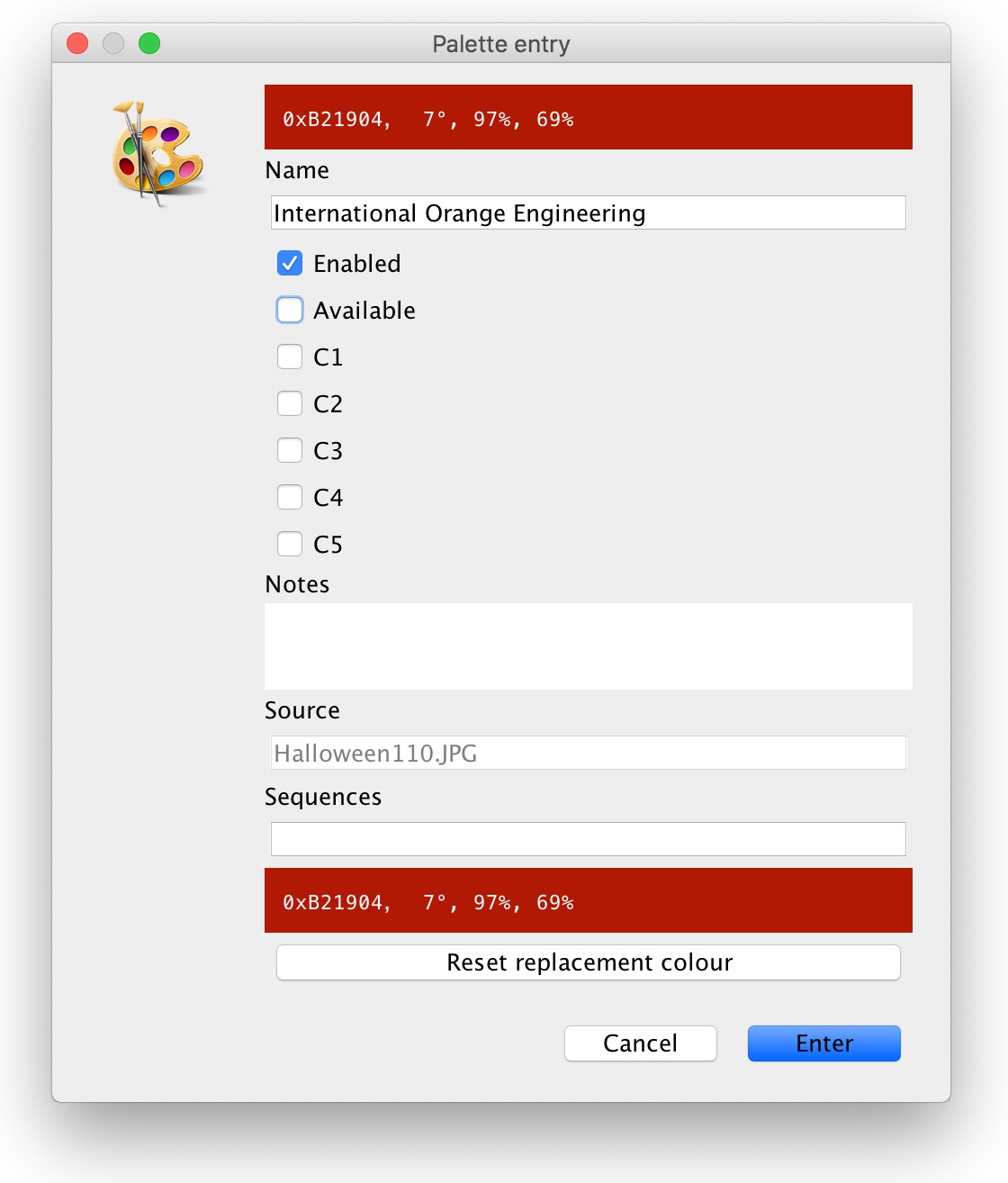
Palette entry dialog
When a new palette entry is created a dialog will appear showing its details.
A default value for the
Name
field will have been chosen by the system but we could change it to something more appropriate to the subject, eg,
"skin tone - forehead"
The
"Enabled"
checkbox field governs whether the entry will be used in the Paints layer.
This can be toggled from this dialog or directly from the Palette entries table
.
The
"Available"
control governs whether the entry will be listed as an ingredient in the Mixing 6
tool tab.
The other fields will be explained later.
The entry will appear in the Palette entries table
in the Palette 2
tool tab on the right.

The columns shown in the table can be selected from the Palette entries table columns
dialog.

This is a the Palette entries table
with all the columns visible.

Entries can be deleted by highlighting them in the table and pressing
DELETE
or
BACK_SPACE
or
          Palette
          Selected palette entries
          Delete ␡
Work area layers
Now we have a subject image and we know a little about palette entries we can explore the interface some more.
Let's look at the layers in the work area. Some of the layers may be transparent or semi-transparent. The work area usually shows all the layers in a stack.
The layers are:
- oriGinal - the original subject image
- Assuming we've loaded it already.
- Subject - the subject with filters applied
- Will still the same as the oriGinal layer until we use some of the filters to be discussed later.
- sKetch - a sketch generated from the filtered subject
-
To render the sKetch
layer we need to set the
sketch filter
parameters.
It will be blank (transparent) until then. - Paints - the paints image generated with our virtual palette
-
This is a simplified copy of the Subject layer using only the
closest
"Enabled"colour entries in the virtual palette.
Whenever an"Enabled"palette entry is added, deleted or modified this layer will be re-rendered.
It will be blank until we add some"Enabled"palette entries. - Outlines - of the areas of paint
-
This layer shows the outlines of the areas in the Paints layer.
It is re-rendered every time the Paints layer is rendered.
This will also be blank until we add some"Enabled"palette entries. - seLections - a layer showing the currently selected paints (and more)
-
This layer is used to show on the work area which entries are currently selected in the
Palette entries table
.
This will also, also be blank until we add some"Enabled"palette entries and select some of them. - Canvas - a photo of our work-in-progress
-
This layer will eventually be used to hold an imported image of our work-in-progress.
It's blank until then. - comparison X - a layer showing a comparison of two other layers
-
The
controls
for this layer are in the Comparison 4 tool tab. Its most common usage
is to compare the Canvas layer to the Subject
layer but there are other uses. The first time we use it might be to compare the Paints
layer to the Subject layer to see how closely the colours we have added
match the reference.
It's blank now. Do you see a pattern here? - copY - a copy of the work area
-
Capture a copy of the work area with
C
.
Even if it's on top when we copy the work area we won't see anything until we make further changes because it'll be a copy of what was there anyway! It's useful for comparing before and after renderings when building a virtual palette.
Blank until then. Blankety blank.

The Layers tool tab
We can control the ordering of the layers in the stack and their opacity using the Layers 3 tool tab.
Use the sliders to change the opacity of a layer.
Click
on the buttons to see an individual layer on its own at full opacity. Toggle the same button again to re-show the
full stack. Drag the layers by their names to re-order them.
We can also use the buttons in the toolbar at the bottom to look at individual layers.
Or the menus.
but you'll probably get used to the hotkeys pretty quickly,
Add some palette entries already!
Given so many layers will be blank until we add some
"Enabled"
palette entries we'd better do so.
For now, just so we can see everything working, let's add a monochrome set of half a dozen entries using:
Ensure the entries are
"Enabled"
.
View some of the layers and play with their ordering and opacity. Perhaps also make some subject selections to create further palette entries. Explore the layers again to see how they've changed.
With the seLections
layer visible (with the layer having good opacity no opaque layer higher up in the stack)
click
on entries in the palette table to see them highlighted. See that the selection changes in the palette table.
Click
in the work area panel to highlight the closest enabled entry to the filtered subject at that point. This is the
entry used in the Paints layer.
If we
click
on an area that is already selected the appropriate palette entry dialog is shown.
Hold down
and
click
entries in the work area or the table to incrementally add them to or remove them from the set of selected
entries.
Palette creation strategies
The artists I've watched painting seem to use one of two basic approaches. Let's call them renderers
and refiners
.

The renderers
start at a particular object or feature and render it to completion before moving on to another area. For
example, some portrait painters fully render the eyes, one at a time, before moving down the nose then to the
mouth etc.
In art, the hardest skill to learn is to be simple. As artists, we have a natural inclination to create detail; we must overcome this tendency. The first rule is to begin big and simple, then move toward small and complex. Sergei Bongart

The refiners
start
loose then refine. They cover their whole canvases with block-ins of colour. Then they go over it repeatedly,
refining it each time, adding intermediate tones, details and texture.
Work around the canvas two or three times or more before moving to any detail. It is entirely possible, and often advisable, to spend 90% of your time merely adjusting the big, simple shapes before ever moving to the rendering. Once this is satisfactory, the chosen style or technique can be completed with confidence, up to and including ultra-tight realism. Sergei Bongart
Other artists who work in layers and can adopt different strategies for each.
A renderer's strategy
Renderers will want to add more entries than refiners to start with. How many will depend on the nature of the subject.

DSC01598: Suzanne Santo

with 40 palette entries
View the Paints layer and
click
on any area that doesn't look like the right colour yet.
Keep glancing back at the Paints layer until it shows something you'd be proud to produce as a painting.

40 palette entries
Stringification

40 entries in the colour space widget
If we look at the colour space widget in the Space 1 tool tab we will see where entries are very close to each other and some could be removed.
We'll probably see strings of entries which could be better replaced by an evenly spaced sequence.

paired and organised to 15 entries
A refiner's strategy
Start Loose then Refine! … Many artists want to be detail superstars right off the bat, and that's a challenge. You must work your way up to the detail stage by providing a framework of brush strokes to build upon. Andrew Tischler

just 3 colours
Refiners will want to add a few palette entries, paint them, add a few more, paint them and repeat until they're satisfied.
Add further entries working with the most important areas first.

Intermediate tones
The comparison threshold strategy technique is also useful here.
Indeed it might be easier to build the palette entry set using the same methods as the renderers
above
and then disable all but a select few to get a set for an initial simple block-in. Subsequently more can be
re-enabled and the painting refined and the process repeated until the whole set is used.
The comparison threshold strategy
One way of choosing the colours for the entries is to use the comparison X
layer. We need to have at least one enabled palette entry to start this rolling.
click
on the work area to choose the first colour. We can then compare the filtered Subject
layer to the Paints layer.
          View
          Work area layer
Comparison
|
Comparison X layer |
                    View
                    Right pane
                    Comparison controls
|
Comparison 4 tab |
                    Work area
                    Comparisons
                    Comparand 1
                    filtered subject
|
or use the select box |
                    Work area
                    Comparisons
                    Comparand 2
                    paints
|
or select box |
                    Work area
                    Comparisons
                    Comparison type
                    Show unmatched
                      colours
|
or select box |
Starting with the threshold control slid left to its minimum we can gradually increase it until some image colours show. These are the subject colours that are furthest from any existing enabled palette entries. Select an area from them to create another entry. When the Paints layer is re-rendered areas of a colour close to that one will disappear from the comparison X layer. Increasing the threshold and selecting out-of-threshold colours will further refine the Paints layer. We can toggle between layers until we're satisfied with the Paints layer.


Three colours is enough to define the form of our subject (it's a shark). The comparing the Paints layer to the subject shows that the transitions between the dark and light are a medium green.


Picking a few of these and then turning up the threshold highlights some more varied greens and some different blues. A 90% comparison threshold shows we could go further still but these twelve colours are more than enough to show the subtleties of the form of the shark and the gradient of the depths.
Underpaintings


Some artists from both of the camps above like to paint an initial monochromatic base layer first and add the colours in a second pass once the placement of everything and its value structure is in place.
For them the tone strings are a great starting point as above.
One day Alice came to a fork in the road and saw a Cheshire cat in a tree. "Which road do I take?" she asked. "Where do you want to go?" was his response. "I don't know," Alice answered. "Then," said the cat, "it doesn't matter." Lewis Carroll