Learn to paint with the Artist's Helper
The Artist's Helper is an application that can help you learn to paint.
A digital helper for physical art.
Painting is simple. Just put the right colours in the right places.

- Give it a photo of your subject and it will help you adjust, analyse and simplify it. It will help you break the image into areas of similar colour for an initial block-in stage.
- Give it a photo of the paints on your palette and it will help you mix the colours you need.
- Give it a photo of your work-in-progress and it will give suggestions for what to do next.

And it's free!


|

|

|
| Reference image… | help from the Artist's Helper… |
final painting |
Until the student has become the master
Once we are comfortable with various tasks, say we'd rather draw our own sketch or choose our own colours, then we can do those bits on our own. With each new painting we can take on more of the responsibilities ourselves until we don't need it anymore.
For if you cannot paint what you see you will find your self handicapped in trying to paint what you imagine. Harold Speed
The Artist's Helper helps artists with the craft of their painting but it can't help painters with their art.
In the same way violinist plays his scales, so as to acquire the capacity of producing pure tones on his instrument and training is ear to appreciate accurately the intervals between the different notes, so the painter trains his eye to perceive accurately the appearances on his retina, and trains his hand to express accurately these perceptions. Not that playing scales is music, or training the eye is art; but because without this training we have no control of the means by which artistic things are done. Harold Speed
How do you learn a sport? You do drills. A Language? Conjugate endless verbs. A musical instrument? Scales. All the misery of repetition, the horror of sitting here in this hall with these zombies suddenly seems worth it. Dan Harris, 10% Happier (it makes more sense in context).

Gallery
Hello, I am Bob. Delighted to make your acquaintance.
I'm not really a painter but I painted these (using little or no natural talent) with the aid of the Artist's Helper and I learned a lot on the way.


If you follow the same processes there is no reason why your paintings shouldn't be as just good or better. I had a lot of fun making these and I have learnt a lot in the process.
About natural talent meh, skip this bit
When I say using little or no natural talent
I am not saying I do not have any natural talent,
only that I did not use any. I simply followed the Artist's Helper
's processes and advice as rigorously as possible.
Just for comparison this is how awesomely talented I was without any help.
 It's supposed to be a boat.
Skills, not talents
Actually there's no such thing as natural talent. Not when it comes to painting. There is only understanding and practice.
What's more practice
is somewhat over rated. When someone really understands a skill they can
be pretty good even if they haven't actually done it before.
Colour mixing
I found colour mixing difficult. So I wrote a program to help me understand colour and work out paint recipes.

We can select a target colour from the reference image. Then we need to tell the program what paint colours we have available as mixing ingredients. One way to do this is to load a photograph of samples spread out on a palette.
The program displays our target colour and our ingredient paints in an interactive colour-space-widget. This shows us what ingredients to combine to make a trial mixture. Mixing lines are drawn to show what the various ratios of ingredient paints will give.
We can photograph and load the trial mixes to find how close we are and what to add to get closer still.
A sketch
We need a sketch as a scaffold from which we can hang our paint.
Picking out suitable lines to trace is not easy in some photos. Scaling and printing it to the right size can be tricky too.


If we enter the size of our canvas our helper will scale it and print it over multiple sheets. Each sheet will have overlaps at the edges and markers to help line them up accurately.
Colour breakdown
Seeing the colours in a scene is more difficult than it sounds (see colour judgement above). Judging the relative values of different colours, that is their lightness or darkness can be even harder.
We can decide which colours we want to use by manually picking them from the subject, having the helper automatically choose some for us or loading them from a photo of the paints or colours that we have available (useful when we can't so easily modify our available colours such as for mosaics, embroidery etc.) .
Once we have a trial set of colours it would be nice to see what a picture would look like using only these. We can add more colours to refine the picture further or disable some to simplify it.


Outlines
As we now have a pop-art style block-in of colours it might be handy to have a outline map/cartoon of them.
The outlines get very complex but pre-filtering the subject image can remove a lot of noise.


The little blue rectangles show where I have sampled colours from the subject image.
Filters
Whilst I was writing filters for smoothing and simplifying I added some others for brightness, saturation, contrast, sharpness, hallucinogens etc.


Although it it possible to over-do these things…


Comparisons
Once the painting is in progress it is hard to see where we may be going wrong. What needs more work and what we should leave well alone? So I wrote something to compare photos of our work-in-progress to the reference image.
Several metrics are available and can be displayed in different ways.

Original photo: Oakley

The painting in progress

DeltaE: the colour shown indicates the colour distance between the subject image and a photo of the canvas.

Baseline: show areas whose colour difference is over a value specified with a slider control

Luma: highlight the differences in colour values.

Saturation: highlight the differences in saturation

Hue: it looks bad but large differences don't matter at low saturations.
Not a very useful measure but it is included for completeness. Somebody might need it one day.

HueAndSaturation: hue differences scaled by the saturation
Much more useful. We are looking pretty good here.


Glaze: the colour of the glaze that would get the canvas closer to the subject.
Colour difference extended and exaggerated by a slider value. Pay particular attention to colours that aren't simply an exaggerated version of the subject, eg. the blue behind the nose.
Who is the Artist's Helper aimed at?
It's aimed mostly at me, …but it has value for:
- The absolute beginner who wants to paint but doesn't know where to start
-
Learn how to paint with the assurance of a satisfactory outcome for your endeavours.
With this software there is no need for dozens of time wasting, trial and error attempts which will probably be immediately discarded before you create your first worthwhile painting.
Those first embarrassing efforts, floundering in the dark, can dent confidence and derail enthusiasm.
Practice versus guidance
We are often told that the only way to learn to paint is to practice, practice, practice. But practice does not make perfect. Practice makes permanent. If we practice at doing it wrong we will get very good at doing it wrong. Habituated. We need guidance.
Guidance from the Artist's Helper can save us years of grinding. It cannot
make us into artists
but it can help us become good painters.
However, it will only help us learn to create works from reference images.
We will soon be able to paint a decent picture without needing any of that old natural born talent
rubbish.
- The more experienced painter who wishes to understand the nature of colour
-
The colour visualisation tool can help achieve an understanding of the dimensions of colour. It can answer questions like
why can a mix of blue and yellow look green?
orwhy do mixtures of complementary colours produce greys?
. -

colour-space: blue plus yellow - The scholar who wishes to study the palettes of existing paintings
-
Drag an image of a painting into the colour chart to see the colours used in a three dimensional space which we can rotate, tilt and zoom.
Some paintings have fluorescent colours which just cannot be achieved with standard paints.
-
 Johannes Vermeer - Girl with a Pearl Earring - 1665
 Francoise Nielly - UNTITLED 594 - 2011

 Johannes Vermeer - Girl with a Pearl Earring - 1665
 Francoise Nielly - UNTITLED 594 - 2011
The tutorial The very quiet call to action
So, now you know what it is, you should read the tutorial.
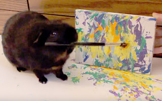 A guinea pig painter